Warm Color Palettes: The Secret of Cozy, Luxurious Homes
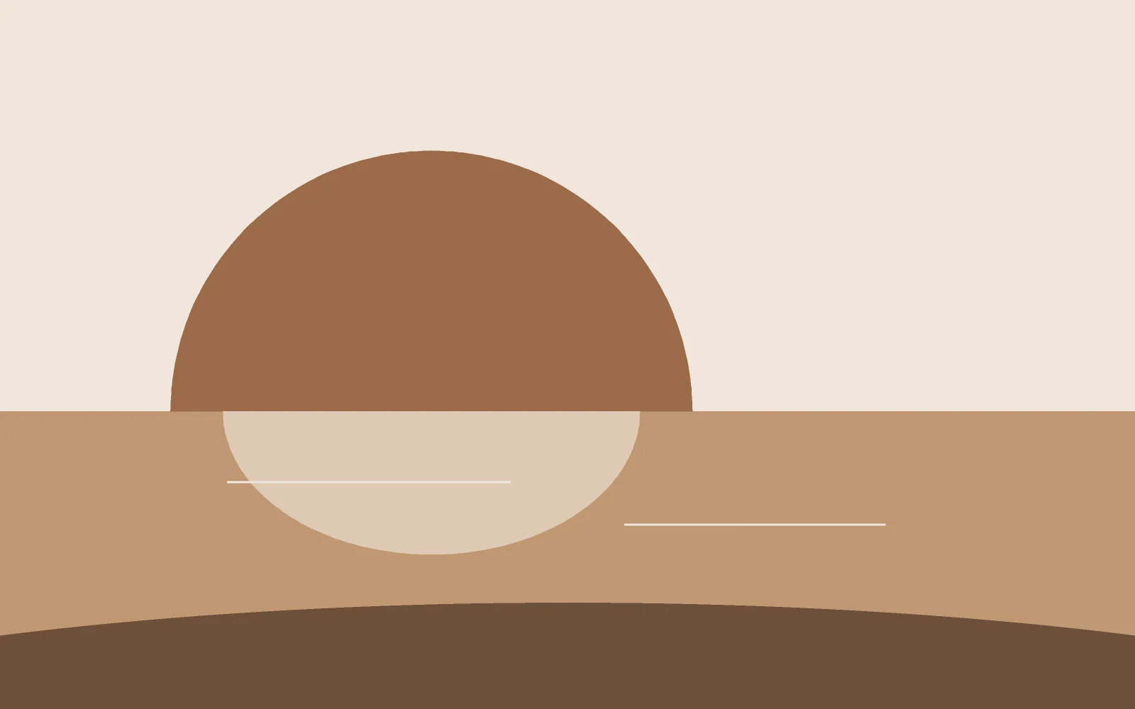
Put photos of homes that feel both cozy and luxurious side by side and one pattern emerges: they are built on warm neutral palettes — cream, beige, sand and traces of gold.
Why warm colors feel cozy
Warm neutrals reflect light softly, glowing golden in the evening. Our minds link them to earth, wood and sunlight — hence the sense of calm.
The 60-30-10 formula
- Base (60%): walls in light cream.
- Middle (30%): furniture and textiles in beige and sand.
- Accent (10%): dark brown, bronze and gold details — the layer that turns simple into luxurious.
Where art fits
A calm palette needs one focal point, and decorative art is the perfect one: choose a piece that repeats two or three room colors and amplifies one accent.
Common mistakes
- Everything matching — flat and lifeless
- Cold lighting — choose 2700-3000K bulbs
- No dark anchors — the room feels afloat
Related Artworks


Comments (5)
Leave a Comment
فاطمه کریمی
Sep 15, 2026
تابلو «خاک» که معرفی کردید دقیقا همین پالته! برای پذیرایی با مبل شتری فکر میکنید مناسب باشه؟
گالری ابرا
Sep 16, 2026
انتخاب بسیار خوبی است؛ رنگهای ترراکوتا و کرمِ «خاک» با مبل شتری همخانوادهاند و طلایی آن نقش لایه تاکید را بازی میکند. برای مشاوره دقیقتر میتوانید عکس فضا را در واتساپ برایمان بفرستید.
امیر
Sep 12, 2026
نکته دمای نور واقعا مهمه. ما لامپها رو عوض کردیم و باورم نمیشد همون خونه است. کاش زودتر این مقاله رو خونده بودم.
گالری ابرا
Sep 13, 2026
دقیقا همینطور است امیر عزیز؛ نور گرم ارزانترین و موثرترین تغییر دکوراسیون است. ممنون که تجربهتان را نوشتید.
سارا موسوی
Sep 10, 2026
فرمول ۶۰-۳۰-۱۰ رو نمیدونستم! الان فهمیدم چرا خونهمون با اینکه همهچیزش کرمه ولی حس خاصی نداره؛ لایه تاکید نداریم اصلا.